
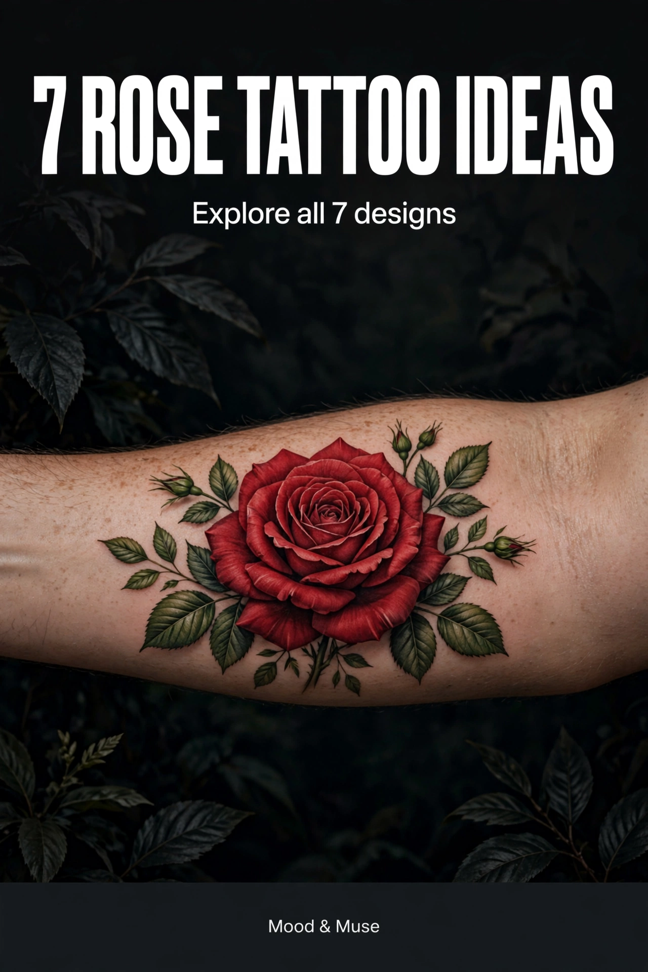
A rose tattoo can look soft, bold, old-fashioned, or completely modern. The difference is rarely the flower itself. It is the line weight, the amount of colour, the size of the bloom, and how much skin is left clear around it.
A single rose can carry the whole design. A stem, a few leaves, or one extra motif can change the mood without making the tattoo busy. These seven ideas show different ways to use the same flower, so you can compare them before you talk to an artist.
1: Realistic Red Rose

A realistic red rose works best when the petals do most of the talking. Deep red shading in the centre of the bloom, lighter edges on the outer petals, and a few green leaves give it depth without needing extra symbols.
This is a strong choice for a forearm. The bloom can sit across the widest part of the arm, with the stem running toward the wrist and the leaves filling the space on either side. Ask your artist to keep the darkest shading inside the folds of the petals, so the rose still reads clearly from a normal distance.
Design note: Compare a fully open bloom with a half-open one. An open rose feels softer; a tighter bud reads as more graphic.
2: Fine-Line Single Rose
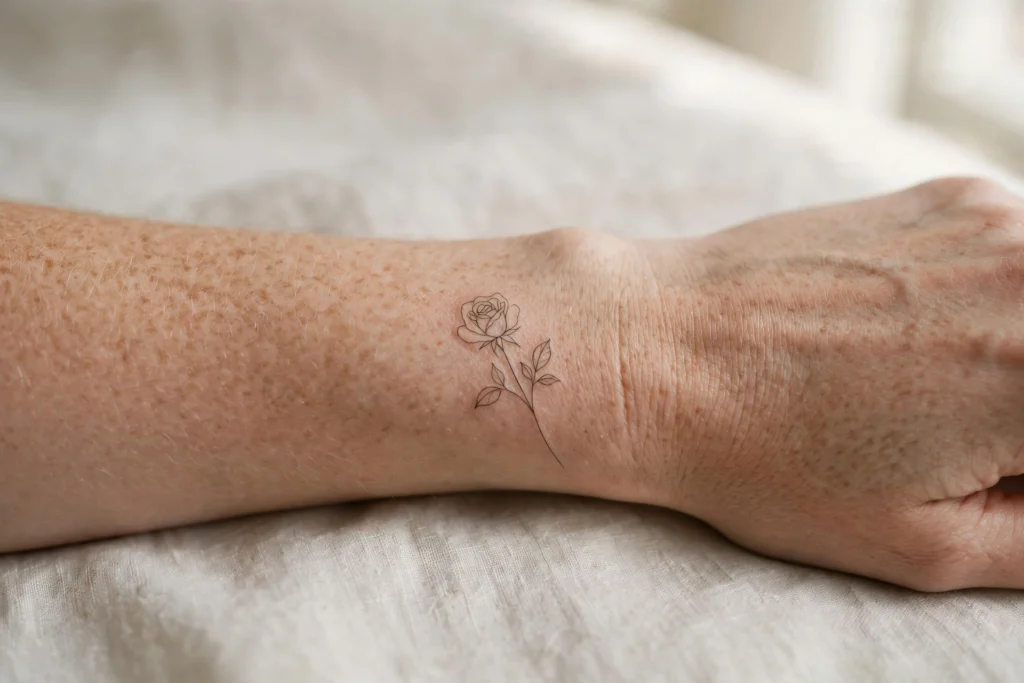
A fine-line rose uses one thin stem, a small bloom, and very little shading. The outline is the design, so any wobble in the line will show. That is why this style suits a steady, experienced fine-line artist.
It works well on a wrist, behind the ear, or along the collarbone, where a larger design would feel crowded. Keep the leaves to two or three at most. Too many small leaves can blur together as the tattoo ages, while a clean stem keeps the shape readable for longer.
Design note: Test the size on your skin first. A rose that looks delicate on a screen can feel large once it is on a wrist.
3: Blackwork Rose
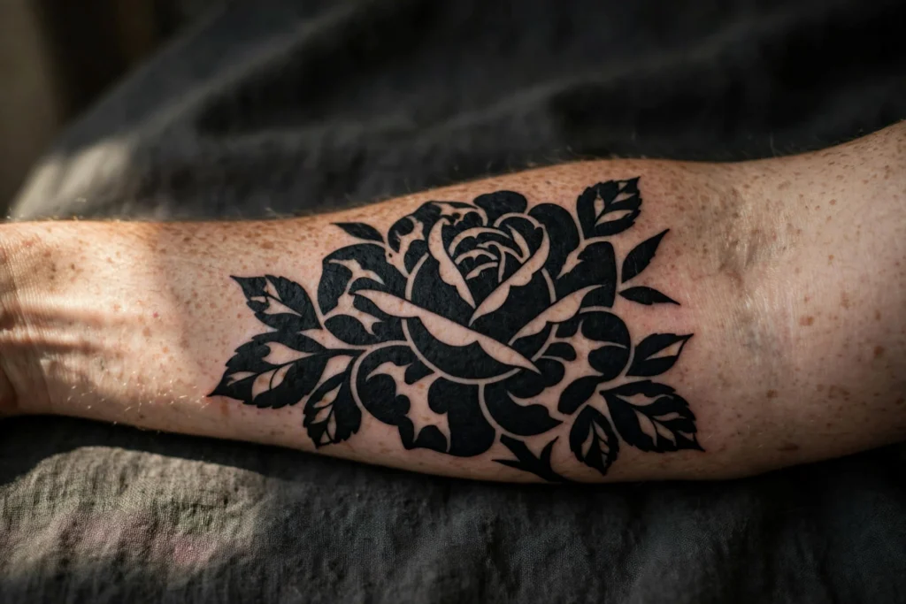
A blackwork rose trades colour for contrast. Solid black petals with open, uninked gaps create the shape of the bloom, and the leaves are filled in the same dark tone.
This version suits a forearm or upper arm, where there is room for the dark areas to breathe. The open gaps matter as much as the ink. If every petal is filled solid, the rose can turn into one dark block. Ask your artist to leave clear channels of skin between the petals, so the flower keeps its form.
Design note: Blackwork ages well when the shapes are bold. Avoid very thin black lines inside a solid design, as they can close up over time.
4: Small Minimal Rose

A small minimal rose is a single bloom, sometimes with a short stem, at about the size of a coin. It is a good first tattoo because the commitment is low and the placement is easy to cover if you need to.
Good spots are the wrist, ankle, behind the ear, and the top of the shoulder. The design should be simple enough to read at that size: a clear bloom, a short stem, and no more than two leaves. Fine detail that looks good enlarged will often disappear at this scale.
Design note: Keep the bloom facing outward when the arm is relaxed, so the rose reads correctly in normal use, not only in a photo.
5: Watercolour Rose

A watercolour rose uses soft washes of red and pink around a lightly outlined bloom, with a few paint-like splashes outside the main shape. The effect is looser than a realistic rose and more colourful than a fine-line one.
It suits a forearm or shoulder, where the washes have room to spread without running into another tattoo. The outline should stay clear even where the colour is soft. Without that outline, the bloom can look unfinished once the colour settles.
Design note: Ask how the artist handles the edges. A watercolour rose needs a defined bloom in the centre, with the loose colour kept to the outside.
6: Rose with Thorns

A rose with thorns adds a stem with small, sharp points and a slightly longer, vertical shape. The thorns change the feeling of the design without changing the flower. It reads as tougher and more direct than a rose on its own.
This works well as a vertical forearm piece. The stem gives the design a natural direction, with the bloom near the elbow and the thorns running down toward the wrist. Keep the thorns small and spaced out. Large, crowded thorns can dominate the bloom and make the whole piece look spiky from a distance.
Design note: Decide first whether you want the thorns to be a clear part of the design or a quiet detail. A few small thorns are enough to make the point.
7: Rose and Crescent Moon

Pairing a rose with a crescent moon gives the design a calm, night-time feel. The curved moon acts as a frame above or beside the bloom, while the rose keeps the composition grounded and familiar.
Place the moon slightly off-centre rather than directly above the rose. A small gap between the two shapes helps each one read clearly. A few dots can link them, but they should stay secondary to the bloom and the moon.
This suits an upper arm or shoulder, where the moon has space to curve without being squeezed. On a narrow forearm, the moon may need to be smaller than you expect to keep the rose as the main subject.
Design note: Use one rose and one moon. Adding stars, clouds, or a second flower can quickly make a simple idea feel crowded.
Choosing Your Rose Tattoo
If you keep coming back to softer designs, start with the fine-line rose or the small minimal rose. If you want contrast, compare the blackwork rose with the realistic red rose. The watercolour version is the clearest choice for colour, while the rose with thorns and the rose with a crescent moon are the best options if you want one extra meaning in the design.
Save two designs you like most and note what draws you to each: the colour, the line weight, the size, or the extra motif. Those specific preferences give your artist a useful starting point for a rose tattoo that feels like your own.