
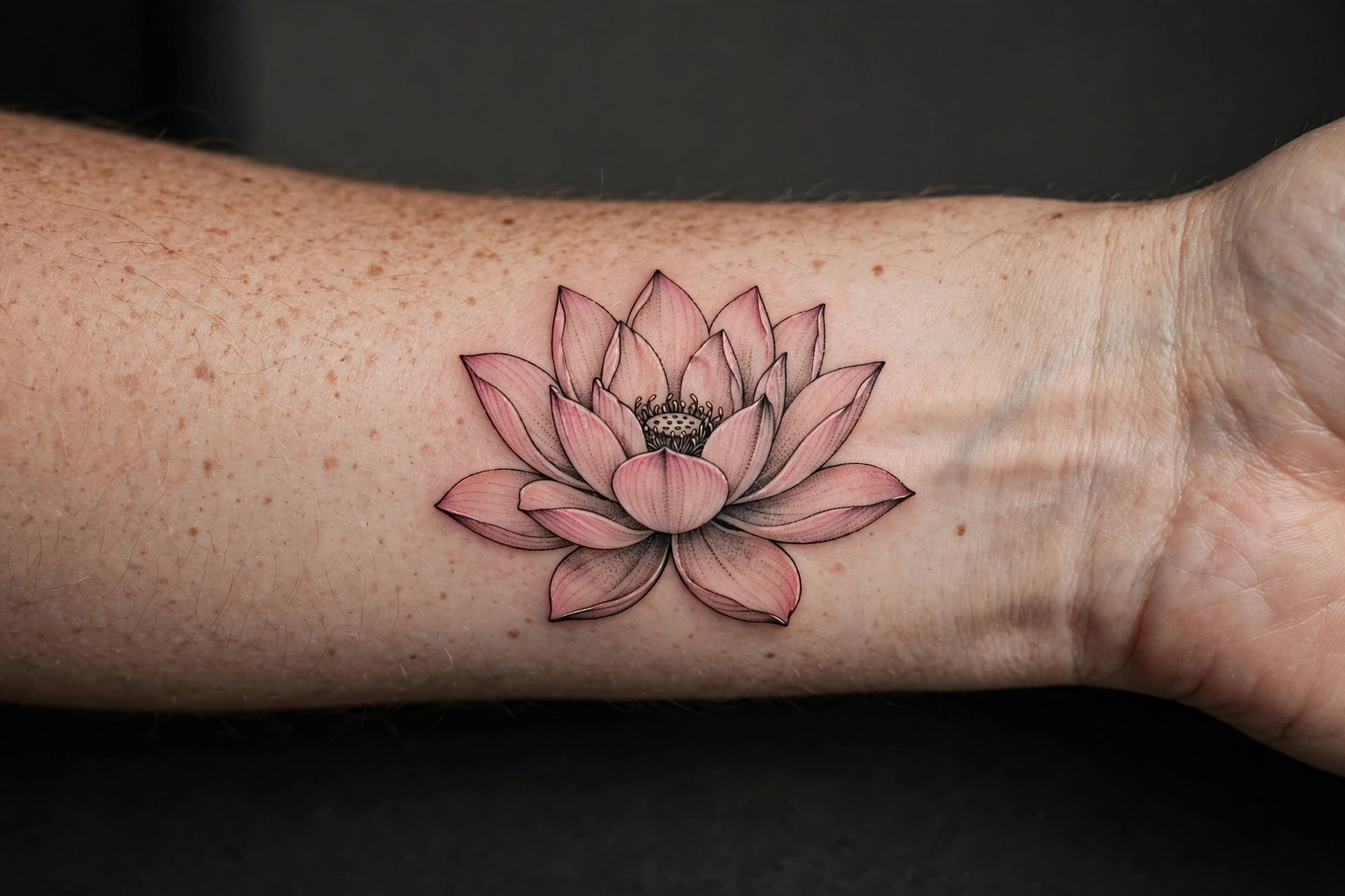
A lotus tattoo is quiet in a way few other flower tattoos are. The petals open in a clear, even shape, so the design reads at a glance, yet it leaves room for shading, colour, or a second motif without becoming crowded.
That balance is why the same flower works as a small wrist tattoo and as a large back piece. The choice is less about the lotus itself and more about how much detail you want around it, how dark you want the lines, and where on the body the petals can sit flat. These seven ideas show different ways to use it, so you can compare them before you talk to an artist.
1: Fine-Line Lotus
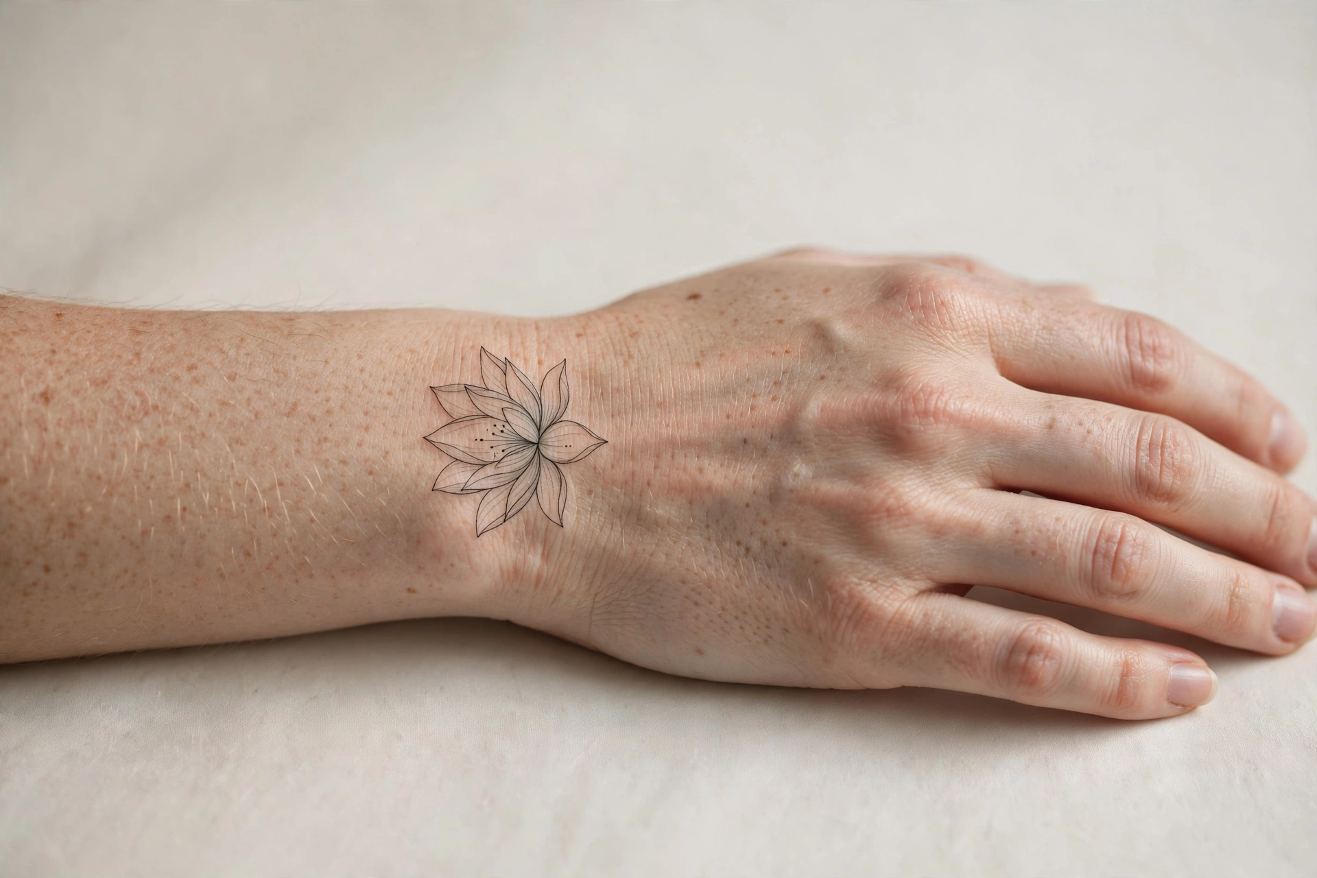
A fine-line lotus uses thin, even lines and very little shading. The petals are drawn as clean outlines, with the centre left open, so the flower feels light on the skin rather than heavy.
It suits a wrist, forearm, or collarbone, where a larger design would feel crowded. Keep the petal count clear and even. Too many overlapping petals at a small size can blur together over time, while a simple, symmetrical bloom stays readable for longer.
This style needs a steady hand, because any wobble in the outline will show. Ask your artist to draw the lotus at the exact size you want it on your skin, not just on paper, so you can see how the lines sit when your arm moves.
Design note: Test the size on your skin first. A lotus that looks delicate on a screen can feel large once it is on a wrist.
2: Blackwork Lotus
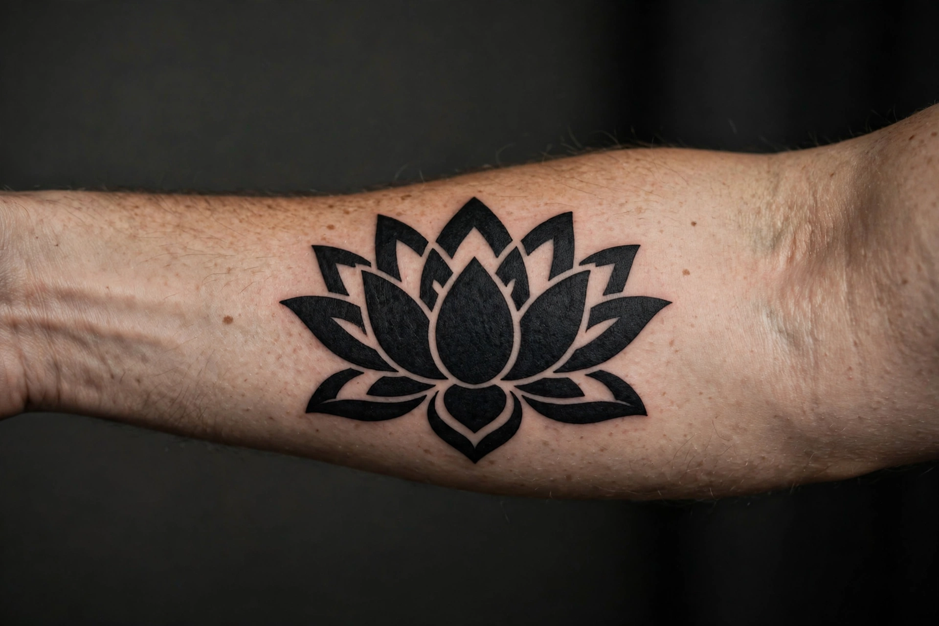
A blackwork lotus trades colour for contrast. Solid black petals with open, uninked gaps form the bloom, and the centre is kept clear so the flower still has a light point to focus on.
This version suits a forearm or upper arm, where there is room for the dark areas to breathe. The open gaps matter as much as the ink. If every petal is filled solid, the lotus can turn into one dark block. Ask your artist to leave clear channels of skin between the petals, so the shape of the flower keeps its form.
Blackwork ages well when the shapes are bold. Thin black lines inside a solid design can close up over time, so the strongest versions keep the petal shapes large and simple.
Design note: Compare a fully black bloom with one that leaves the centre petals open. The open centre keeps the design from feeling too heavy.
3: Watercolour Lotus
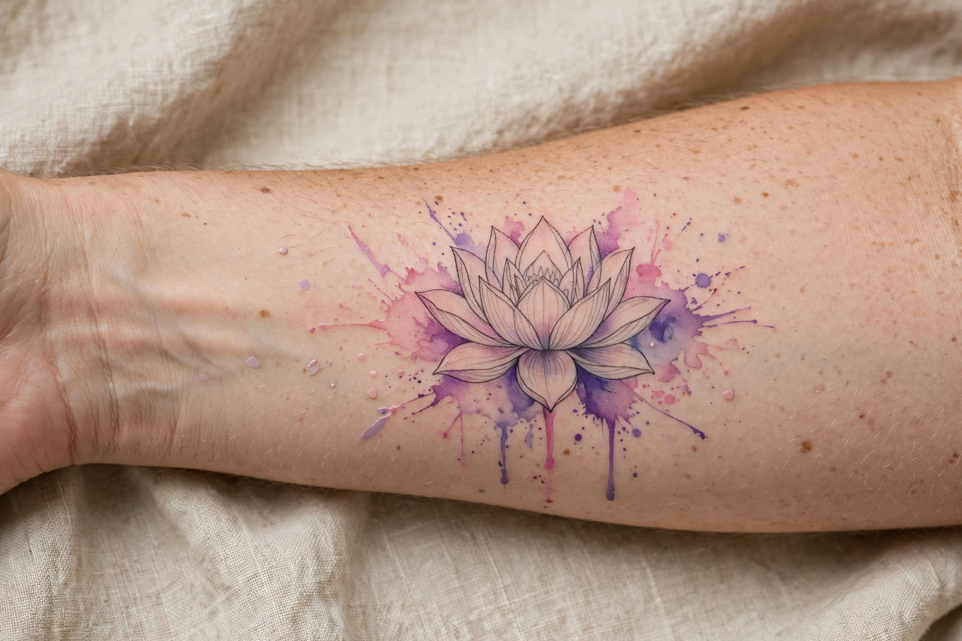
A watercolour lotus uses soft washes of pink, purple, or blue around a lightly outlined bloom, with a few paint-like splashes outside the main shape. The effect is looser than a fine-line lotus and more colourful than a blackwork one.
It suits a forearm or shoulder, where the washes have room to spread without running into another tattoo. The outline should stay clear even where the colour is soft. Without that outline, the bloom can look unfinished once the colour settles.
Ask how the artist handles the edges. A watercolour lotus needs a defined bloom in the centre, with the loose colour kept to the outside, so the flower remains the first thing you notice.
Design note: Choose one main colour for the wash and let a second colour stay in the background. Two strong colours competing for attention can make the petals hard to read.
4: Lotus and Moon
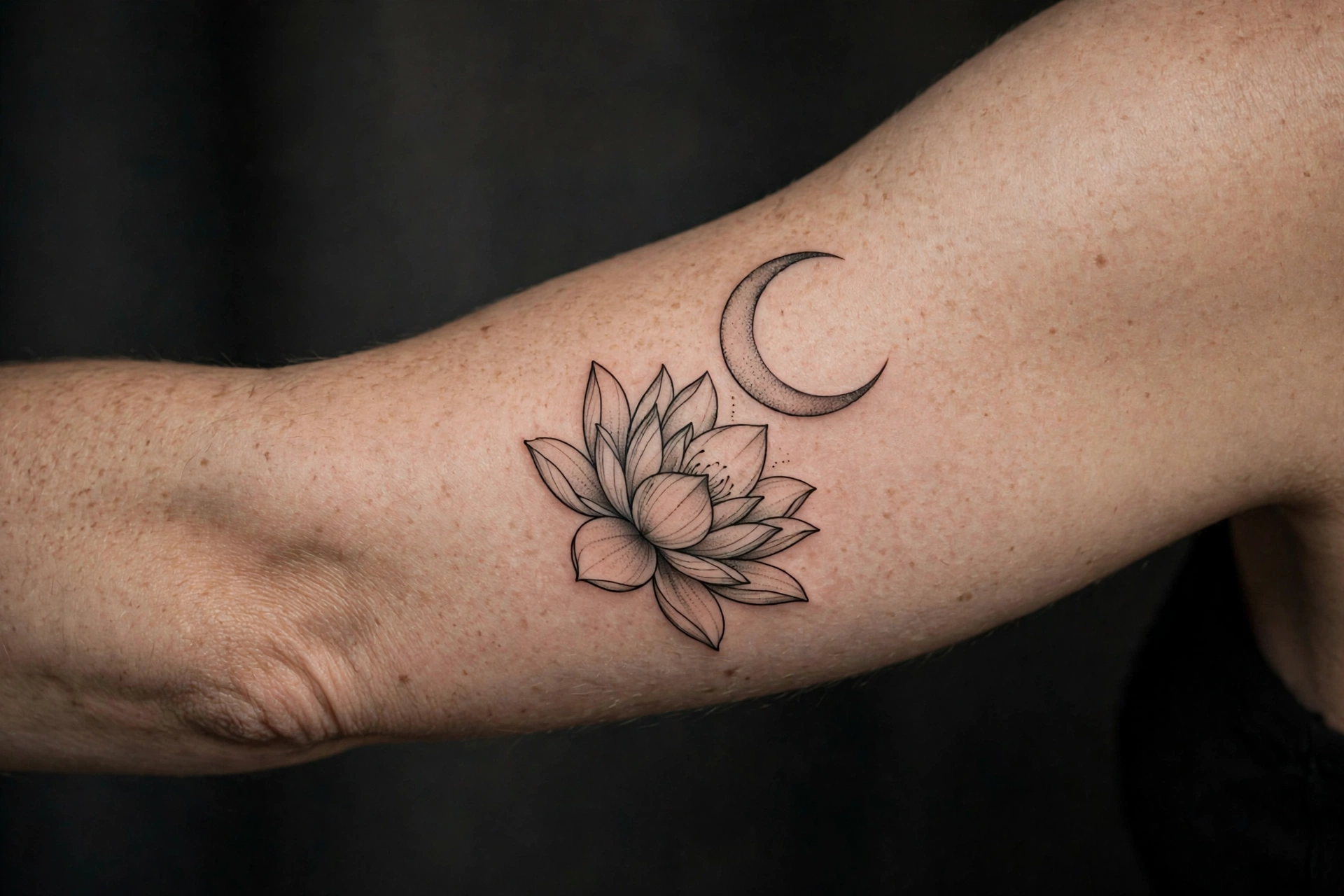
Pairing a lotus with a moon gives the design a calm, night-time feel. The curved moon acts as a frame above or beside the bloom, while the lotus keeps the composition grounded and familiar.
Place the moon slightly off-centre rather than directly above the lotus. A small gap between the two shapes helps each one read clearly. A few dots can link them, but they should stay secondary to the bloom and the moon.
This suits an upper arm or shoulder, where the moon has space to curve without being squeezed. On a narrow forearm, the moon may need to be smaller than you expect to keep the lotus as the main subject.
Design note: Use one lotus and one moon. Adding stars, clouds, or a second flower can quickly make a simple idea feel crowded.
5: Small Minimal Lotus
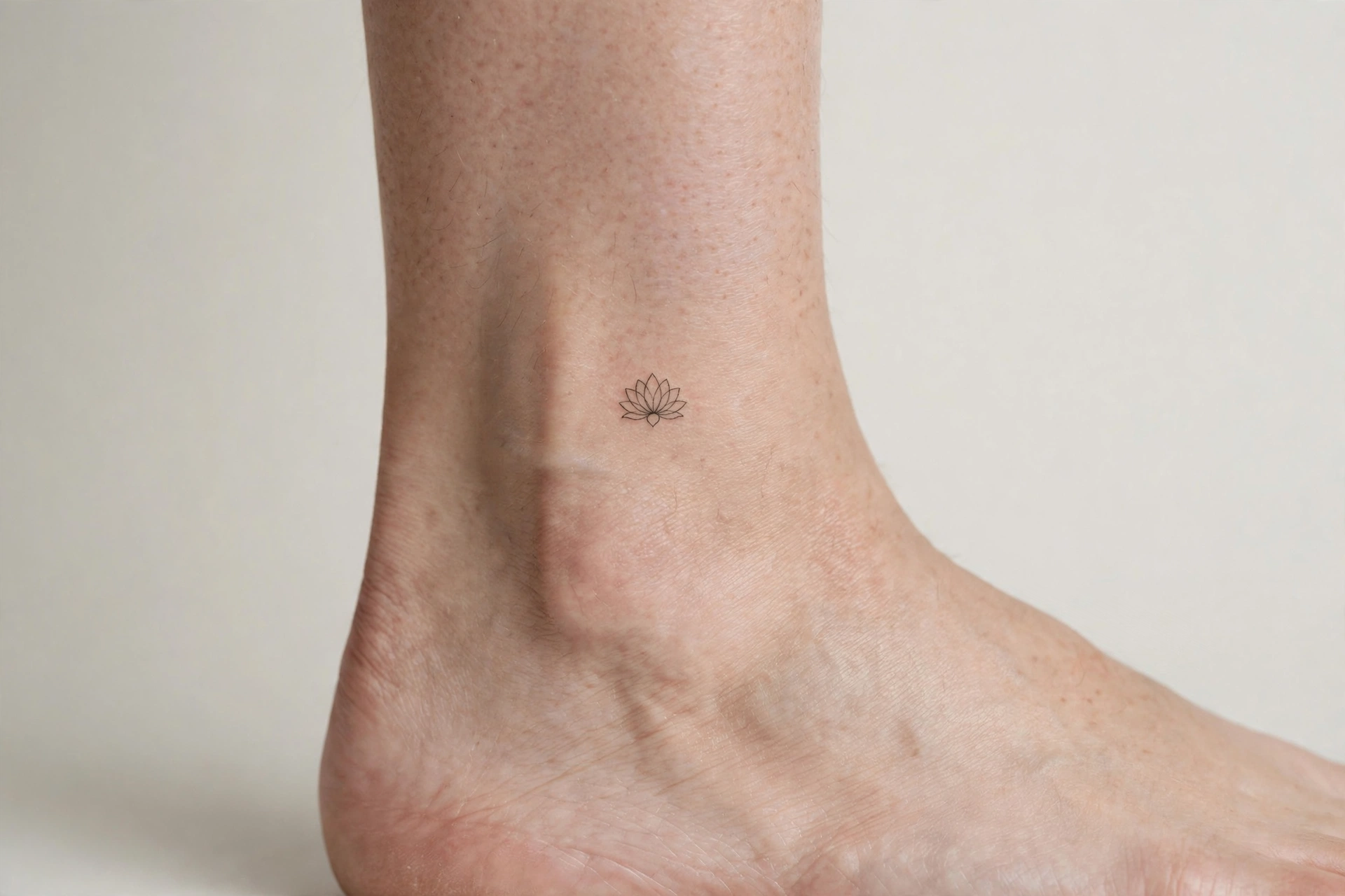
A small minimal lotus is a single bloom, sometimes with a short stem, at about the size of a coin. It is a good first tattoo because the commitment is low and the placement is easy to cover if you need to.
Good spots are the wrist, ankle, behind the ear, and the top of the shoulder. The design should be simple enough to read at that size: clear petals, a short stem if you want one, and no extra detail. Fine detail that looks good enlarged will often disappear at this scale.
Keep the bloom facing outward when the arm is relaxed, so the lotus reads correctly in normal use, not only in a photo. A small design also heals faster and is easier to keep clean in the first days.
Design note: Keep the petal count low at this size. Five or six clear petals read better than a crowded bloom.
6: Ornamental Lotus
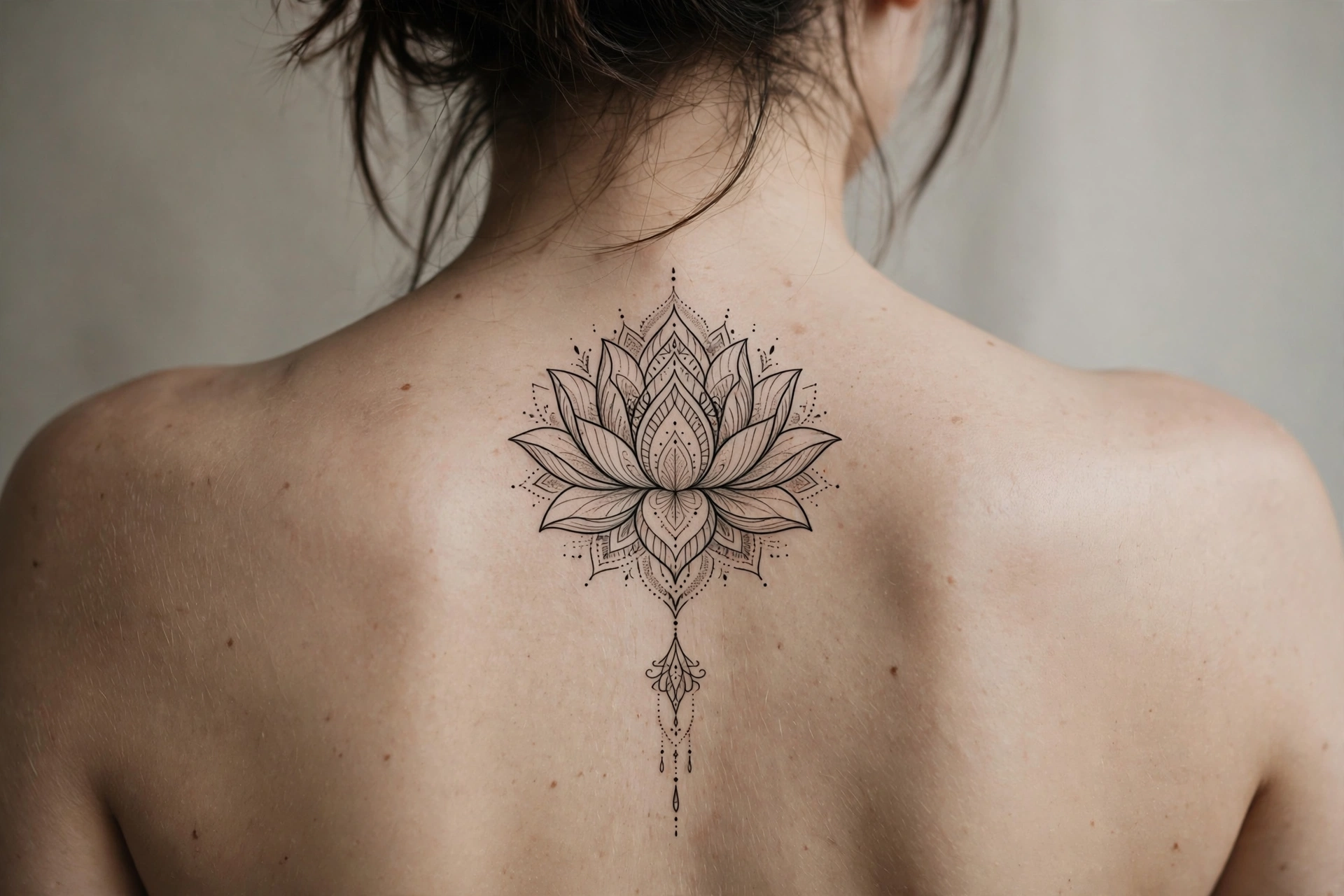
An ornamental lotus takes the petal shape and extends it into a decorative composition. Fine lines, small dots, and a short hanging flourish below the bloom add length and detail without changing the flower itself.
This version suits a back, chest, or longer forearm placement, where the ornament has room to run. The lotus should stay dominant, with the decoration kept as a frame around it. If every section has equal detail, the bloom can disappear inside the ornament.
For placement, ask your artist to adapt the width of the frame to your body. A decorative design benefits from deliberate open space around the smallest details, so the dots and thin lines stay legible.
Design note: Choose the overall length before adding small ornamental details. A clear length keeps the design from growing in every direction.
7: Lotus and Butterfly
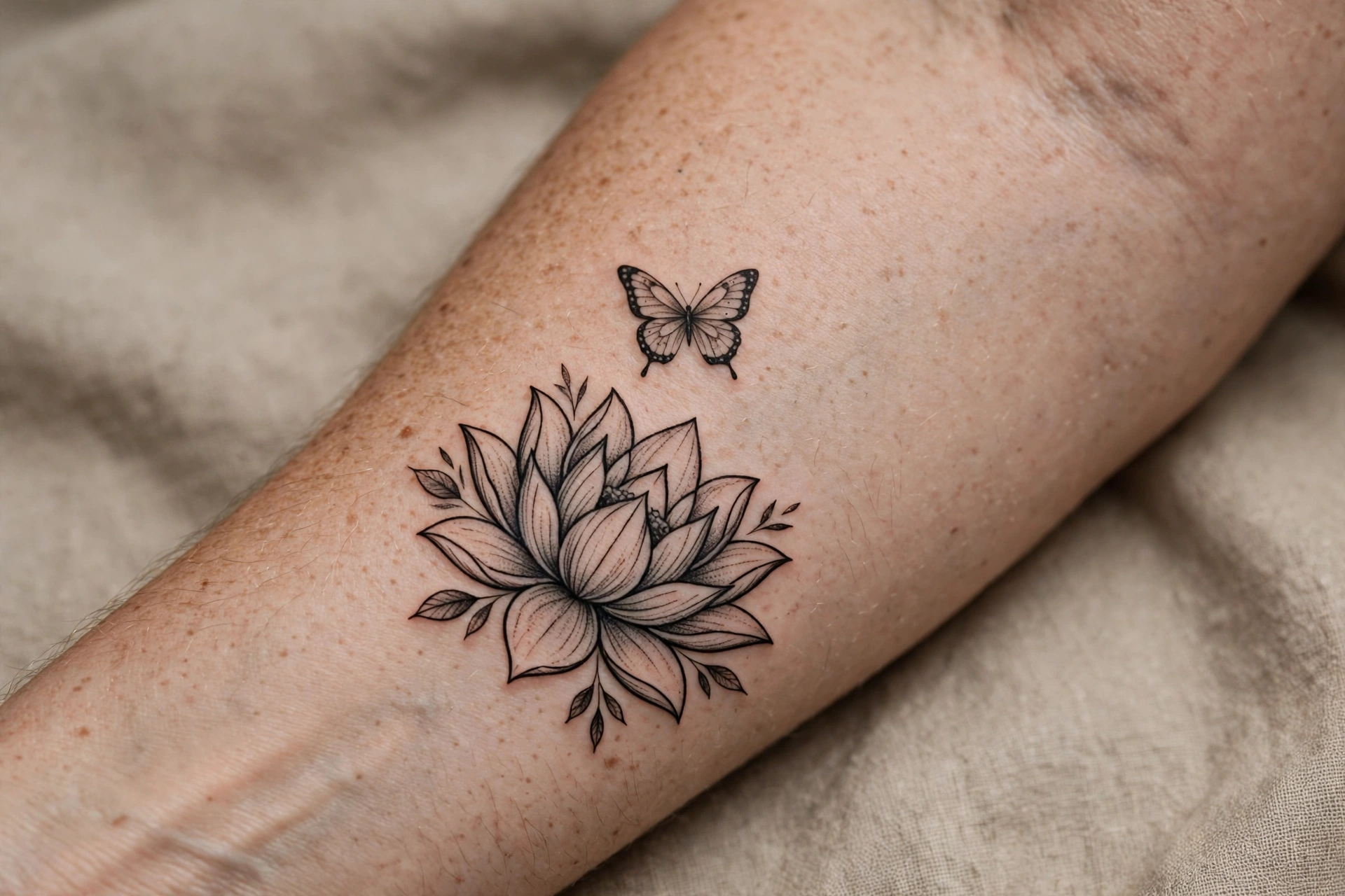
A lotus and butterfly design puts two quiet subjects together: the bloom below and the butterfly above it, as if it has just landed or is about to take off. The butterfly adds movement to a flower that would otherwise sit still.
Keep the butterfly small relative to the lotus, so the flower stays the main subject. One butterfly is enough. Two or more can pull attention away from the petals and make the composition feel busy.
This works well on a forearm, shoulder, or upper back, where the two shapes can sit in a vertical line. Leave a clear gap between the butterfly’s wings and the top petals, so each shape reads on its own.
Design note: Match the line weight of the butterfly to the lotus. A heavy butterfly over a fine-line lotus will look out of place.
Choosing Your Lotus Tattoo
If you keep coming back to softer designs, start with the fine-line lotus or the small minimal lotus. If you want contrast, compare the blackwork lotus with the watercolour version. The lotus and moon is the clearest choice for a calm, night-time feel, while the ornamental lotus and the lotus with a butterfly are the best options if you want more detail in the design.
Save two designs you like most and note what draws you to each: the colour, the line weight, the size, or the extra motif. Those specific preferences give your artist a useful starting point for a lotus tattoo that feels like your own.